The difference between pretty and powerful
Not all resistance looks like protest. Some of it happens in courtrooms, one case at a time. Last week I launched a brand for someone doing just that.
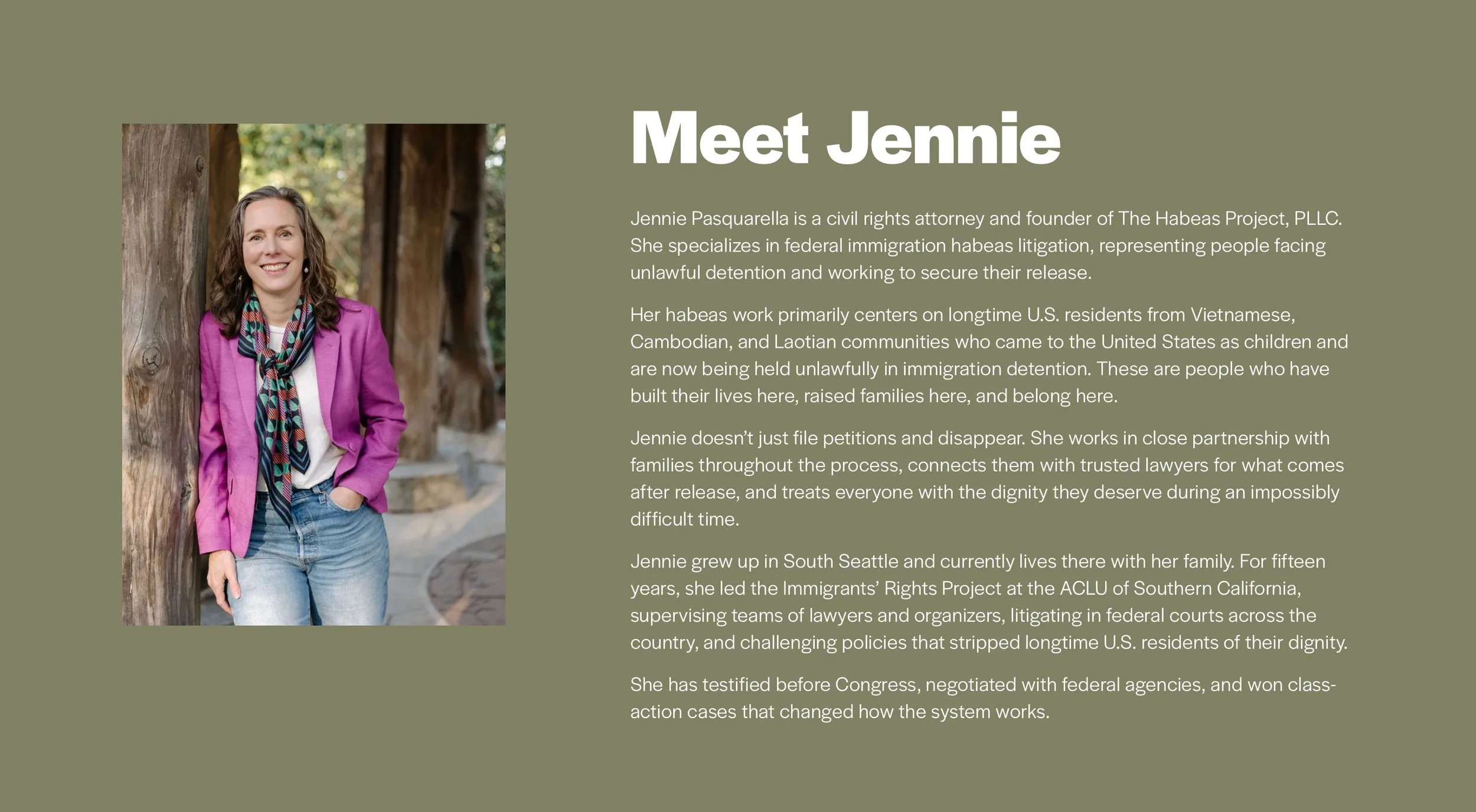
Jennie Pasquarella is a civil rights attorney who specializes in getting longtime U.S. residents released from unlawful immigration detention. She has deep expertise serving Vietnamese, Cambodian, and Laotian communities in the Seattle area.
These are people who came to the United States as children, built their lives here, and followed the rules. It’s Jennie’s job to get them released from detention and bring them home to their families and communities.
A different kind of lawyer website
Most law firm websites are intimidating. Lawyers in suits, walls of big words, lots of navy blue.
We wanted the opposite for Jennie.
When someone’s loved one has been detained by ICE, they're already overwhelmed and terrified. The last thing they need is a website that makes them feel small or stupid.
So here’s how I made sure Jennie’s showing up online differently:
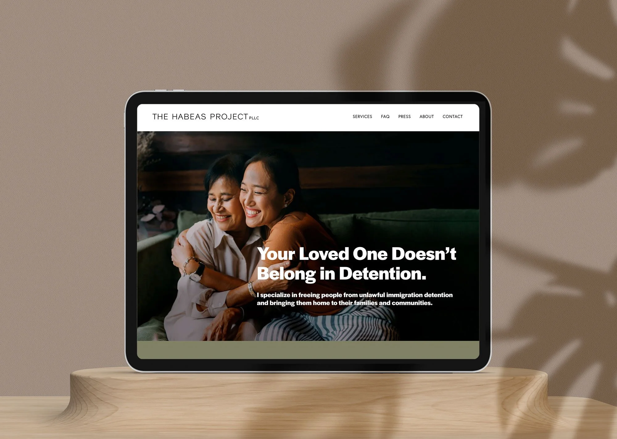
Human-centered imagery
Instead of the typical crossed-arms lawyer portrait, I opened with an image of two people embracing. Because that’s what Jennie’s work is really about—reuniting families.
And then I paired that image with a powerful, straightforward headline: “Your Loved One Doesn’t Belong in Detention.”
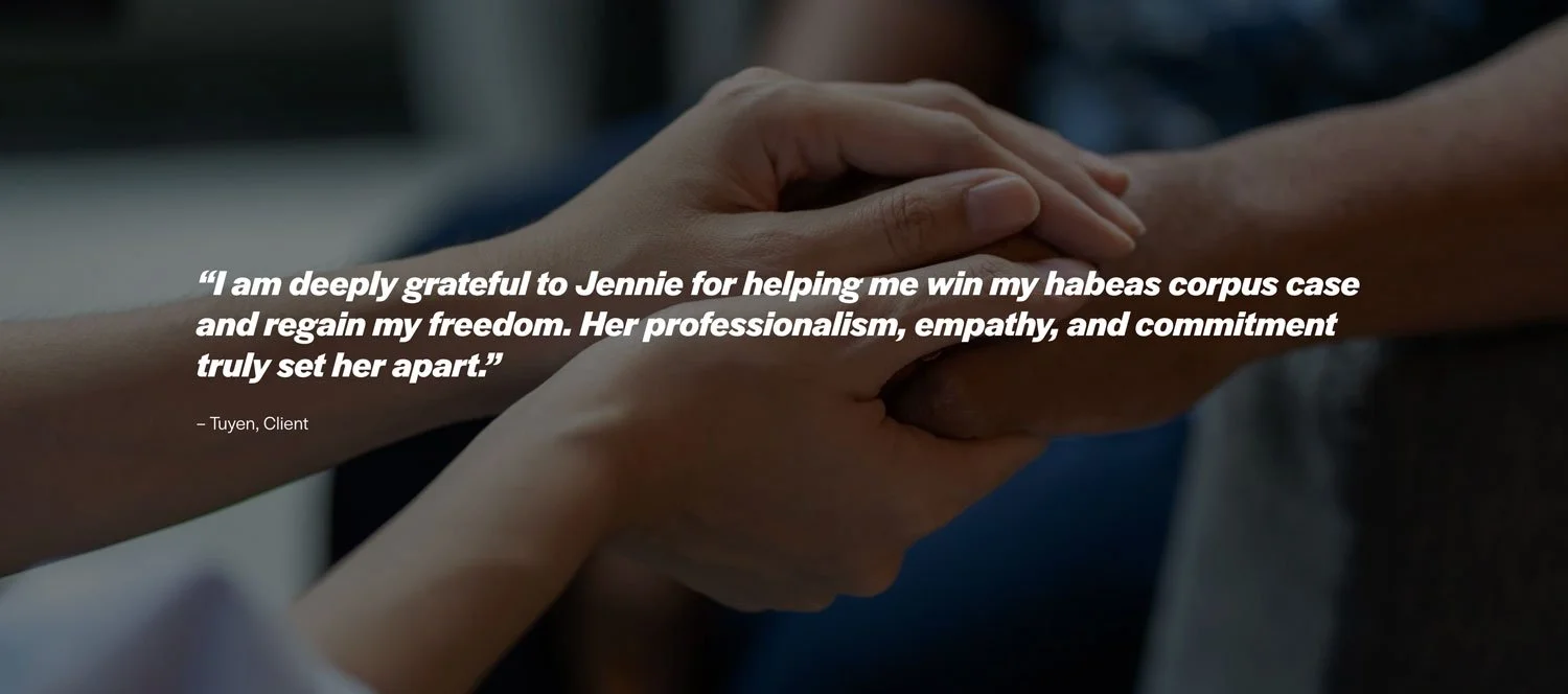
I also used warm imagery to keep the testimonials grounded in the humans behind the words.
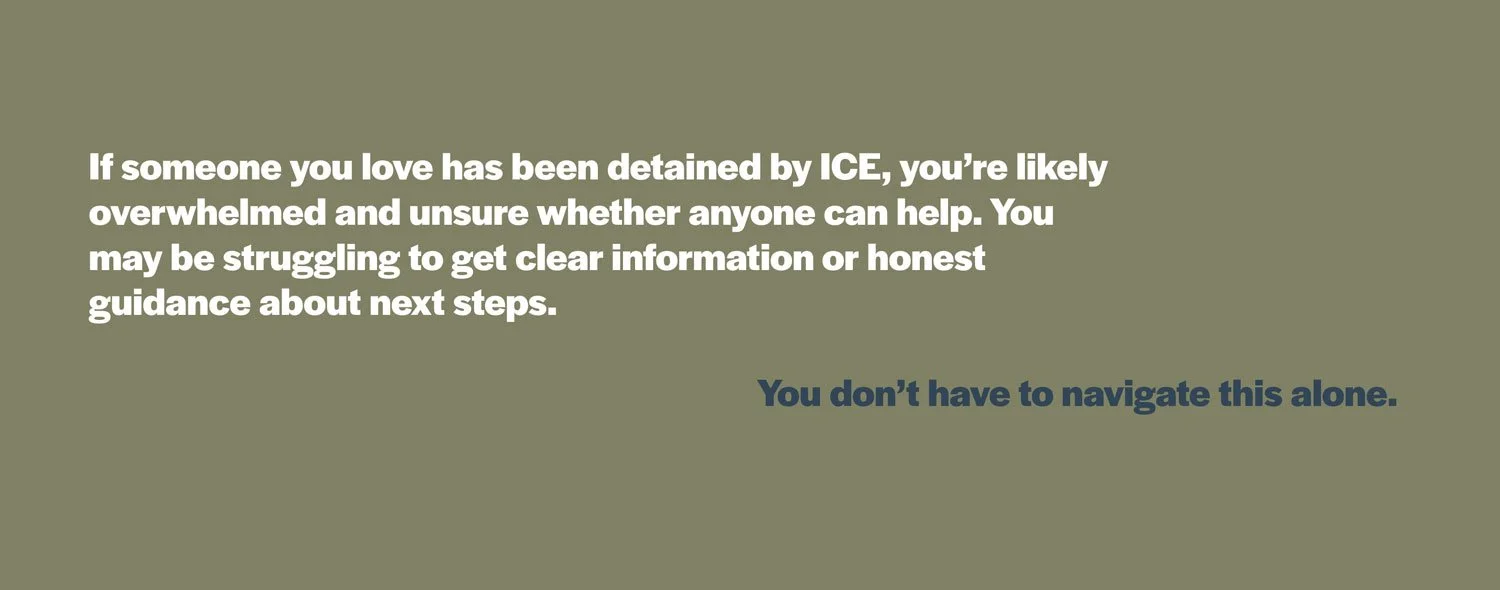
Messaging that creates an emotional connection
I didn’t bury or ignore the emotional reality of what her clients are experiencing. Right on the homepage, in the second section, I wrote: “If someone you love has been detained by ICE, you're likely overwhelmed and unsure whether anyone can help.”
Then immediately: “You don't have to navigate this alone.”
Simple, straightforward language
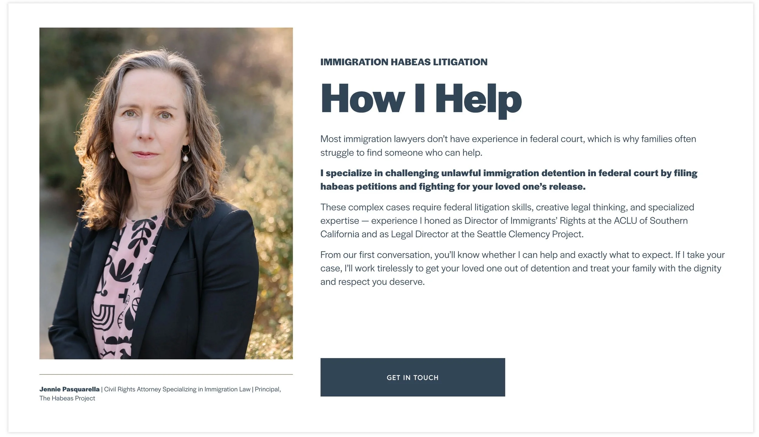
So that her clients feel seen and understood, I wrote copy that speaks plainly about how Jennie can help. By not hiding her services in complicated legal jargon, I’ve made it easy for the right people to say, “Yes, this is exactly what I need.”
A calming visual palette
While I did use a little navy on the site, the color palette is mostly warm olive and sage tones plus a lighter blue—colors that feel calming, grounding, and safe. It’s professional, but also warm and inviting. Soothing. And then Jennie adds some pops of color in her wardrobe choices.
The beautiful portraits by Seattle photographer Julie Harmsen also help potential clients connect with Jennie through the screen.
Speaking to your audience
Whether you’re serving families facing deportation or executives launching their next chapter, the principle is the same: your website needs to speak directly to where your people are right now.
That’s what my Branding Roadmap process is designed to figure out. In 90 minutes, we get clear on:
Who you’re really speaking to
What they’re feeling before they find you
What transformation you’re providing
Exactly how to position yourself so the right people say “yes, this is what I need”
Then I turn that into a strategic plan for a brand and website that actually connects with your audience and converts visitors into clients.
—
Check out Jennie’s full site at TheHabeasProject.com.
Goodies Just For You
WHAT I’M THINKING ABOUT: Anyone read Elise Loehnen’s book, On Our Best Behavior: The Price Women Pay to Be Good? I haven’t yet, but it’s at the top of my list after hearing her and Courtney Smith on Monica Lewinsky’s podcast. They were on together, promoting their new workbook: Choosing Wholeness Over Goodness.
There was so much good stuff, I had to take notes. Stuff about what it really means to be a “good” when you’re a woman and how “women are conditioned to perform goodness and men are conditioned to perform power.” And stuff about the complicated relationship women have with desire. And money. And anger. Oof—so much. Highly recommend a listen.
Did you enjoy this?
Please sign up for my newsletter!