Elevating your Website from DIY to Premium
I’m a web designer, so obviously I think professional, well-designed websites are important.
But what does “well-designed” or “professional-looking” actually mean?
A couple of weeks ago, I ran a poll on LinkedIn. The conversation it sparked in the comments made me realize just how differently people interpret what “professional-looking” even means.
The poll question (a little leading, I’ll admit) was:
→ Would you feel hesitant spending real money on someone whose website clearly looks homemade?
52% said yes — that it does hurt credibility.
But many people added a caveat: a site that feels too polished or “slick” can backfire too.
Let’s do better than “slick”!
Several people used that word — slick. To me, slick means surface-level. All sheen, no substance.
I want to be really clear here: I do NOT believe in designing slick, form-over-function websites.
I believe in creating sites that work. That means they’re designed to earn trust, communicate clearly, and connect with the right people.
So what does that actually look like?
Here’s what I believe makes a website feel truly well-designed…
1. Messaging that speaks clearly & directly to the right people
So many websites—DIY or “professionally-produced”—aren’t clear about what the business actually does, who they serve, or what someone gets by working with them.
Earlier this year I redesigned the website for Catlin O’Shaughnessy, a brilliant personal brand and identity coach.
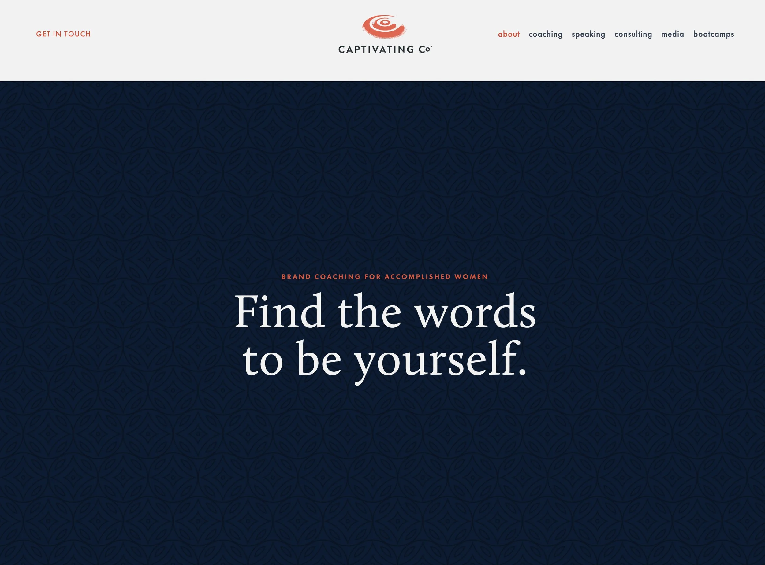
Before (Totally fine)
Her homepage was fine. The typography and color palette were nice, and the headline said, “Brand Coaching for Accomplished Women.” Below that: “Find the words to be yourself.” Like I said, fine.
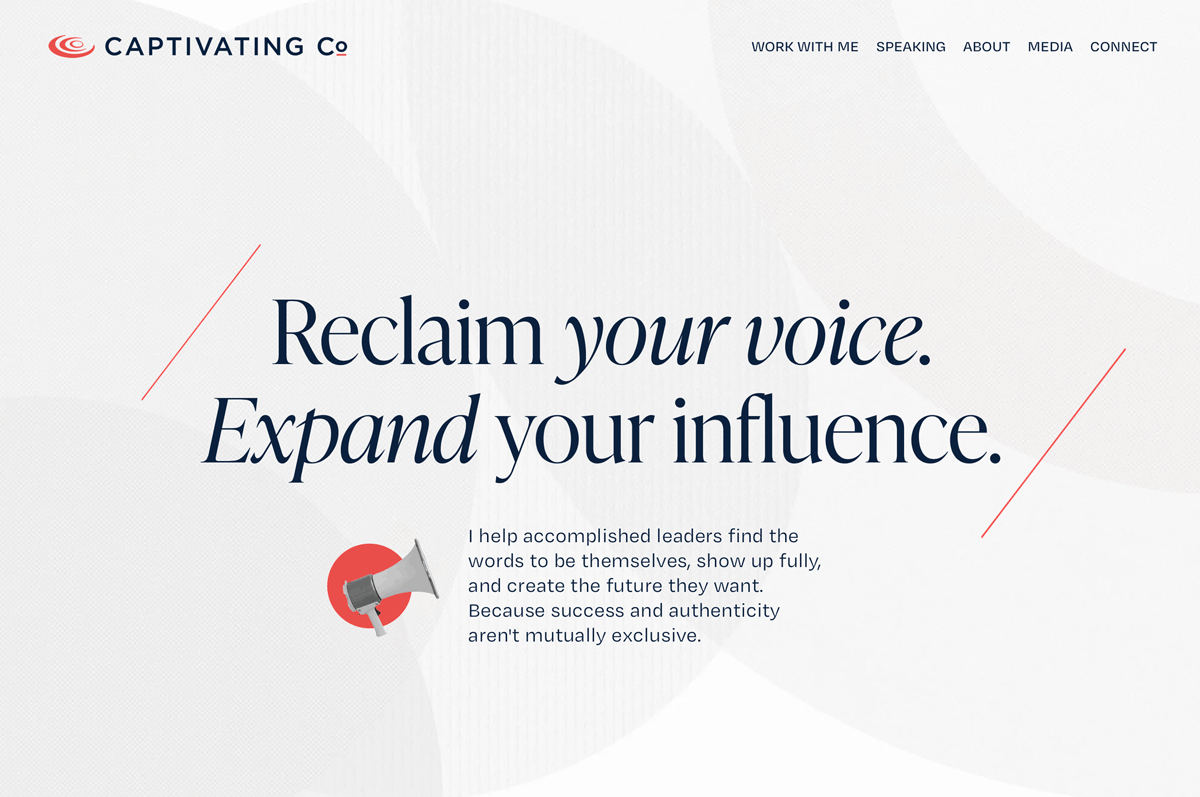
I actually liked what she had, but I updated it to be a little more outcome-focused: “Reclaim your voice. Expand your influence.”
And then I got much more specific in the subhead: “I help accomplished leaders find the words to be themselves, show up fully, and create the future they want. Because success and authenticity aren't mutually exclusive.”
After
This new messaging immediately communicates what she offers, who it’s for, and why it matters.
I also added a fun little animation because even though her clients are corporate, Cat is FUN!
2. Content hierarchy that guides, not overwhelms
There’s nothing less inviting than over-explaining or crowding a page with too much text.
Elegant typography, generous spacing, and thoughtful layout guide the eye and help visitors absorb information without hitting a wall of words.
That means:
Headlines that tell the story on their own
Clear visual structure
Space for the eye to rest
Copy that supports decision-making without overwhelming the reader
Cat’s original homepage included a dense, text-heavy bio. The words were thoughtful, but it asked visitors to work too hard to understand what she offers and why it matters.
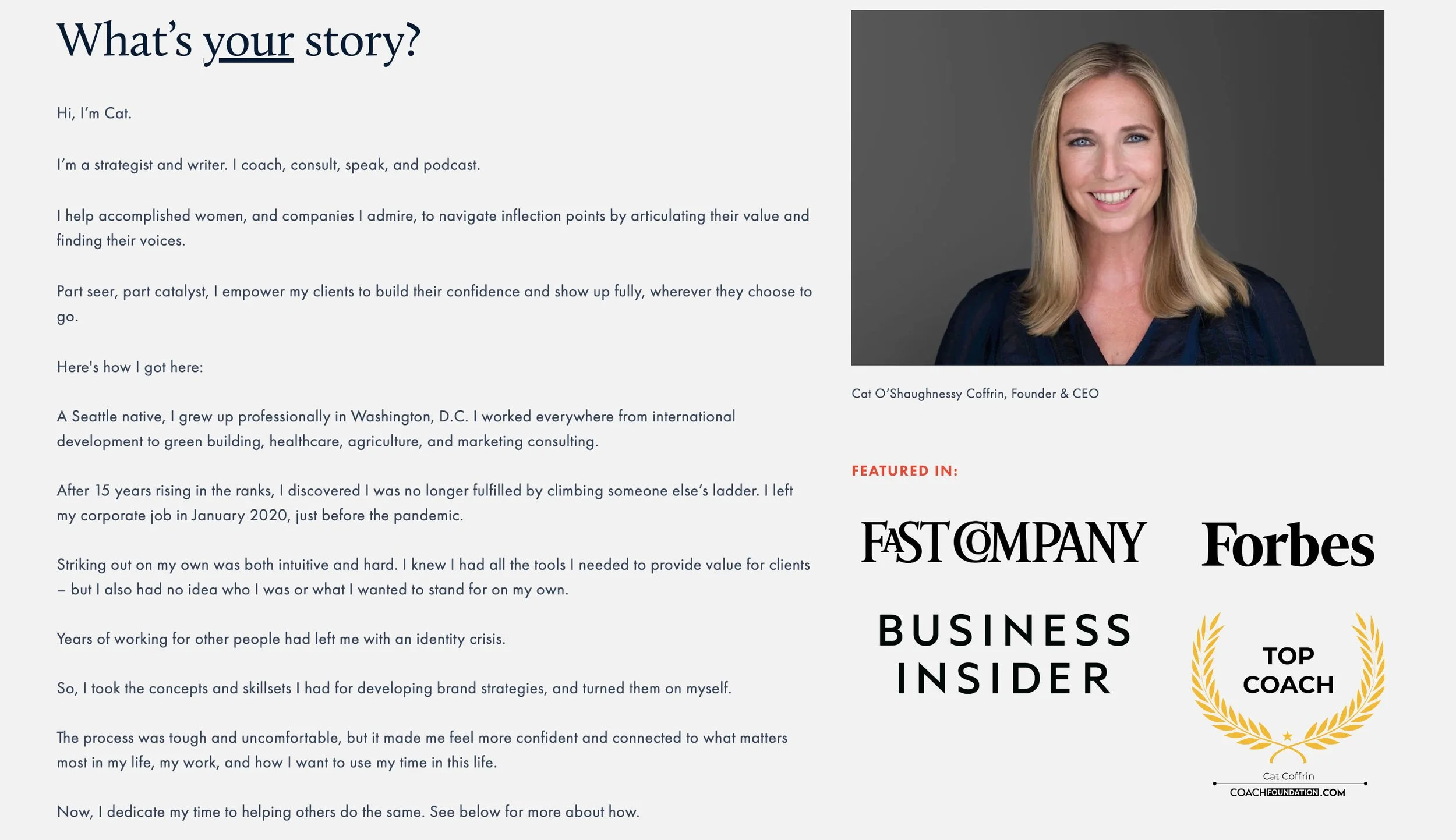
Before. Lots of words.
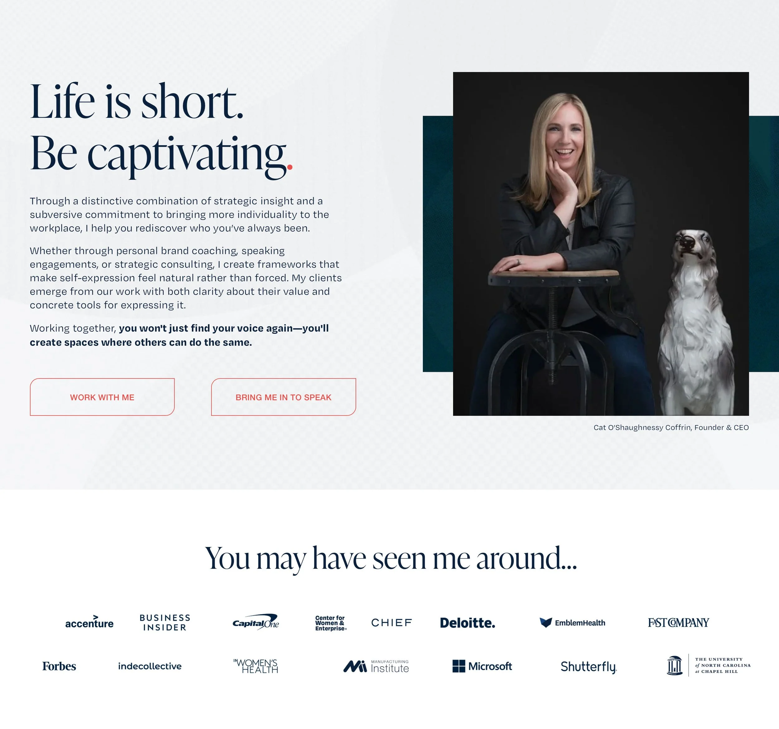
We reimagined that section as a more strategic intro focused on outcomes, value, and next steps. It now sets the tone, introduces her services, and gives the right people a reason to keep exploring.
Snappier copy. Clear content hierarchy. A photo that captures more of her personality.
I also gave her logos and media mentions their own section, giving her social proof more breathing room and impact.
After
Her full bio now lives on the About page. The new homepage intro is focused, welcoming, and action-oriented, with CTAs that guide visitors deeper into the site.
This section now clearly communicates what she does, why it matters, and why you’d want to work with her. It’s easier for the right people to scan, absorb, and say, “Yes, I want this.”
3. Social proof that builds trust without overwhelming the reader
Strong testimonials can tip someone from interested to ready to book.
But too many on one page, all jumbled together, can backfire.
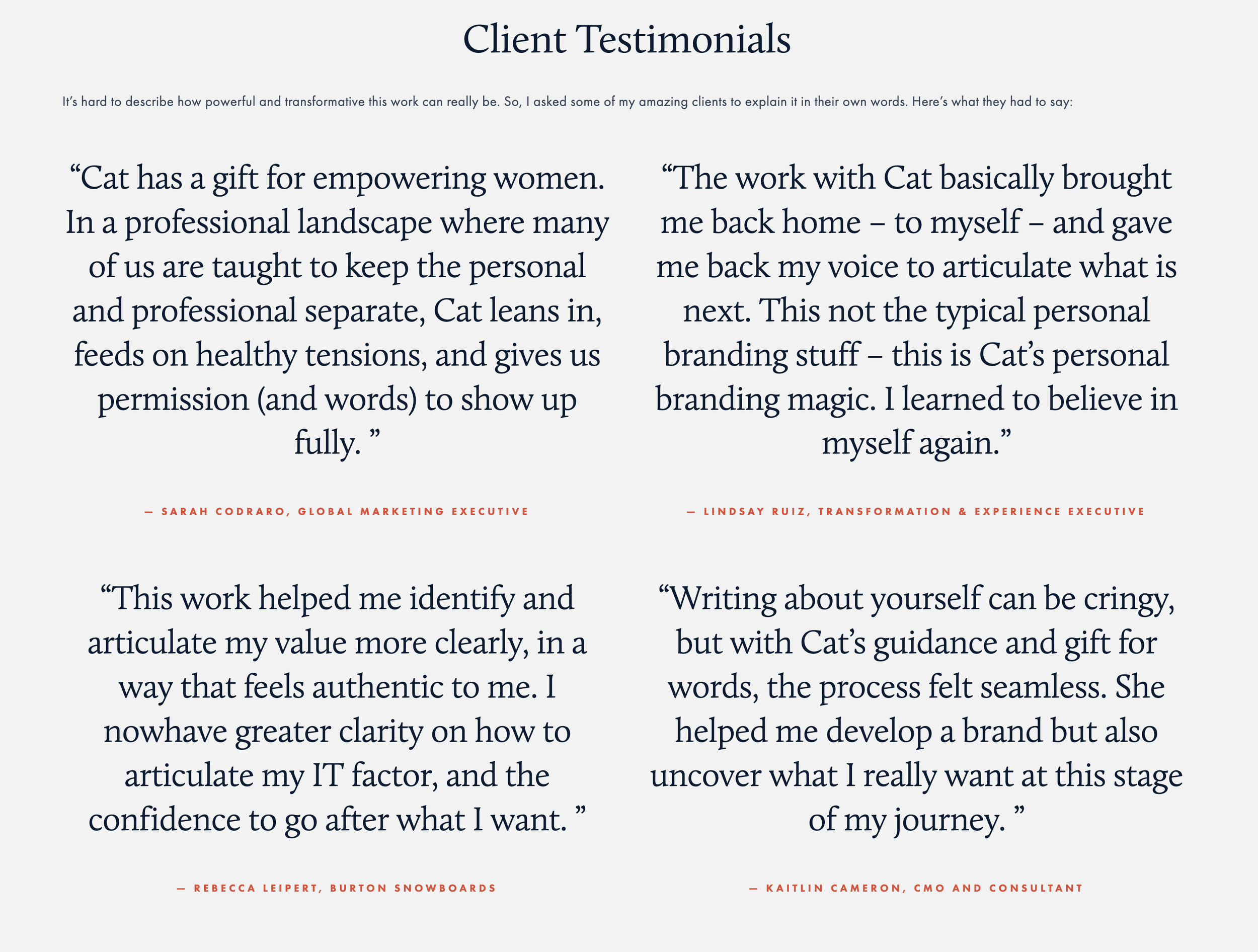
Before
On Cat’s new site, I featured a few standout quotes in isolation. And then added the rest in easy-to-digest carousels (the headline is an animated scroll, which is why it's cut off in the screenshot). This design creates breathing room and helps each quote land with more impact.

After: I sprinkled these isolated quotes throughout the site

After: Each service section also has its own testimonial carousel
4. Navigation that feels effortless
A beautiful website won't do much if people don’t know where to go next.
When people land on your site, is it clear how to get around? Is it easy to take the next step or book a call? If it’s confusing, people will bounce.
For Cat’s site, I kept the navigation simple and streamlined: minimal items in the top nav, simple page structure, and consistent, straightforward CTAs like “Work With Me,” “Book Me to Speak” and “Get in Touch.”
Whew! That was a lot! What’s the bottom line?
Yes, beautiful matters.
But if you work with me, you can be confident I’ll always prioritize communication over slick. My clients’ websites always:
Clearly explain what you do and who it’s for
Reflect your personality and values
Guide people toward action with ease
Build trust before they ever speak to you
Every site should do all that beautifully, but never at the expense of clarity.
Goodies Just For You
WHAT I’M THINKING ABOUT: This week I found myself comparing Amy Poehler’s Good Hang to Smartless, the podcast hosted by her ex-husband. I loved Smartless when it first came out, but it quickly got tiresome. It’s really just a bunch of dudes competing for laughs, more interested in doing bits than actually listening. It’s less of an interview and more of a stage for the hosts. Good Hang is different. Amy Poehler comes prepared, then lets her guest shape the conversation. If they want to do bits, she’s right there with them. But if they’re in the mood for something more grounded, she matches that too. It’s generous. Guest-centered. It feels gendered, in a good way. She’s a great host, and I think a huge part of that is because she’s a woman.
WHAT I’M MAKING: I actually haven’t made these in a while, but I’ve been thinking about them. I usually make them when I’m hosting a brunch, but I was thinking they’d be good to make on a Sunday and then heat up through the week: Prosciutto-Wrapped Mini Frittatas. They’re from my paleo days a decade ago, but they don’t taste like you’re giving anything up. I think it's the salty goodness in the proscuitto. And they come together quickly and easily. The hardest part is separating the dang prosciutto strips!
WHO I’M ADMIRING: I just referred someone to Jess Dyroff and Katie Koch, which reminded me to hype them here too! Katie is a brand strategist and messaging expert and Jess is a really talented designer. Together they run Brightside Creative. They work with bigger companies than I do and they're not wedded to Squarespace. I think their preferred platform is actually Wix. We met through Pia Silva’s coaching program and got to meet IRL at Pia’s retreat last year, so I know they’re also both a great hang! They do fantastic work and they have a similar process to mine, so I’m always happy to recommend them. Check them out!